Scatter Diagrams
A scatter diagram (or scatter graph) is used to show the relationship between two variables by plotting paired values as points on a graph.
Key Points:
- Each point is plotted using an ordered pair (x, y).
- Points should be marked clearly using small crosses (×).
- Always label the axes and choose appropriate scales.
- The pattern of points helps us identify the type of correlation between the variables.
Example:
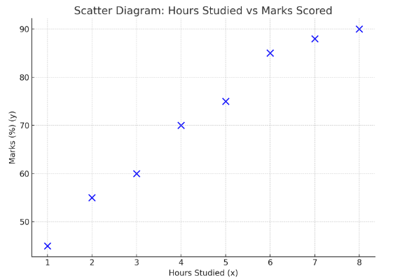
The table below shows the number of hours studied and the marks scored by 8 students: Draw the Scatter Diagrams
| Hours Studied (x) | Marks (%) (y) |
|---|---|
| 1 | 45 |
| 2 | 55 |
| 3 | 60 |
| 4 | 70 |
| 5 | 75 |
| 6 | 85 |
| 7 | 88 |
| 8 | 90 |
▶️ Answer/Explanation
Plot each point on a graph with:
- x-axis: Hours studied
- y-axis: Marks (%)
Mark each point clearly with a small ×.
Understanding Types of Correlation
In a scatter diagram, the pattern of points helps us determine the type of correlation between two variables.
Types of correlation:
- Positive correlation: As one variable increases, the other also increases.
- Negative correlation: As one variable increases, the other decreases.
- No correlation: There is no obvious relationship between the two variables.
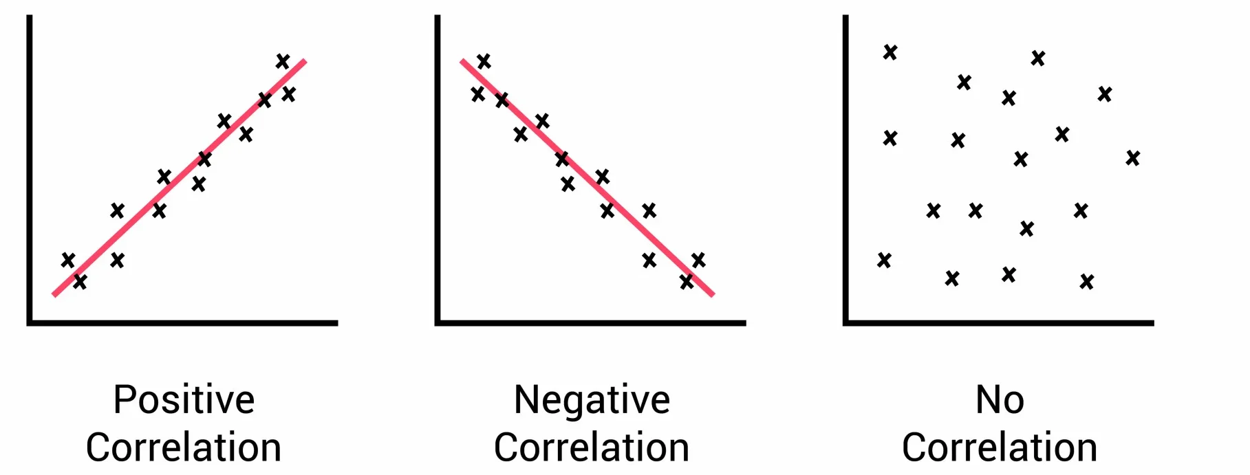
These can be observed visually from the trend of the points on a scatter graph.
Example:
The following data shows the number of hours spent revising and the marks scored in a test. What type of correlation it showing.
| Hours Revised | Test Score (%) |
|---|---|
| 1 | 45 |
| 2 | 50 |
| 3 | 58 |
| 4 | 64 |
| 5 | 72 |
▶️ Answer/Explanation
When plotted, the points rise from left to right, showing that higher revision hours result in higher scores.
Conclusion: This shows positive correlation.
Example:
The table shows the daily temperature and the number of hot drinks sold at a café.What type of correlation it showing.
| Temperature (°C) | Hot Drinks Sold |
|---|---|
| 10 | 100 |
| 12 | 90 |
| 14 | 80 |
| 16 | 65 |
| 18 | 50 |
▶️ Answer/Explanation
The plotted points fall from left to right, indicating that as temperature increases, fewer drinks are sold.
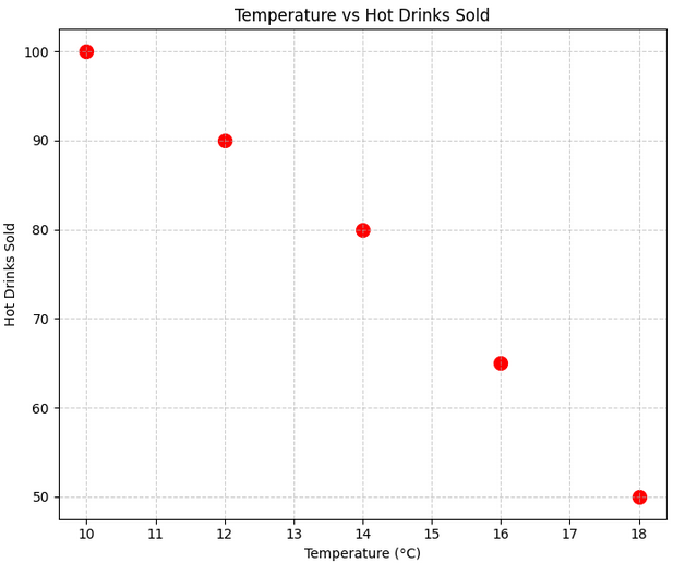
Conclusion: This shows negative correlation.
Drawing and Using a Line of Best Fit
A line of best fit is a straight line drawn on a scatter diagram to show the general trend of the data. It helps to make predictions based on the relationship between two variables.
Rules for drawing the line of best fit:
- It is drawn by eye (inspection), not by calculation.
- It should be a single straight, ruled line.
- It should pass through the “middle” of the data so that the points are fairly evenly spread above and below the line.
- The line should extend across the whole range of the data.
Example:
The table below shows the number of hours 8 students studied and the marks they scored in a test.
| Hours Studied | 1 | 2 | 3 | 4 | 5 | 6 | 7 | 8 |
|---|---|---|---|---|---|---|---|---|
| Test Marks (%) | 40 | 45 | 55 | 60 | 65 | 70 | 75 | 78 |
Draw a scatter diagram. Use a line of best fit to estimate the mark of a student who studied for 5.5 hours.
▶️ Answer/Explanation
Step 1: Plot the 8 points on a graph (x-axis: hours studied, y-axis: marks).
Step 2: Draw a straight line that evenly splits the points above and below.
Step 3: Find 5.5 on the x-axis. Move vertically to the line, then horizontally to read the estimated mark.
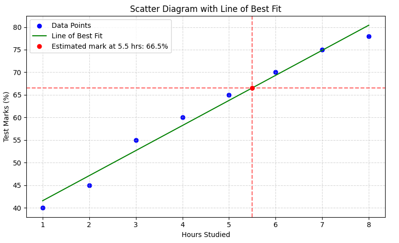
Answer: The estimated mark is approximately \( \boxed{66.5\%} \).
Example
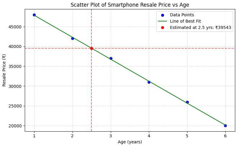
A shop collects data on the age (in years) and resale price (in ₹) of 6 used smartphones:
| Age (years) | 1 | 2 | 3 | 4 | 5 | 6 |
|---|---|---|---|---|---|---|
| Price (₹) | 48000 | 42000 | 37000 | 31000 | 26000 | 20000 |
Draw a scatter diagram and add a line of best fit. Estimate the value of a phone that is 2.5 years old.
▶️ Answer/Explanation
Step 1: Plot age on the x-axis and price on the y-axis.
Step 2: Draw a line that best represents the downward (negative) trend.
Step 3: Find 2.5 on the x-axis → go up to the line → then across to read the value.
Answer: The estimated value is around \( \boxed{39543\text{ rupees}} \).
This shows a strong negative correlation: as age increases, resale price decreases.