Statistical Charts and Diagrams
Statistical charts and diagrams are used to present data visually for easier interpretation and comparison. This section covers various types of charts, starting with bar charts.
(a) Bar Charts
Bar charts are used to represent categorical or discrete data. The height of each bar represents the frequency (or value) of the category.
- Simple bar chart: One bar per category.
- Composite (stacked) bar chart: Bars are split into segments showing subcategories.
- Dual (side-by-side) bar chart: Two bars are placed beside each category to compare two data sets.
Example:
The number of students choosing different subjects is shown below:
- Math – 30
- Science – 25
- English – 35
- History – 20
Draw a bar chart to represent this data.
▶️ Answer/Explanation
Draw the x-axis with subjects labeled and the y-axis showing frequencies (0–40).
Draw vertical bars of appropriate heights: Math (30), Science (25), English (35), History (20).
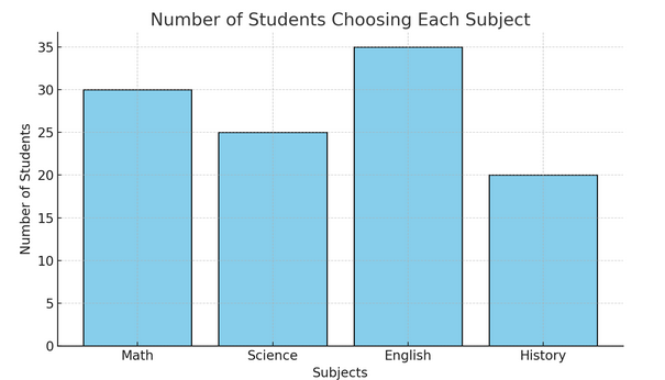
Each bar should be equally spaced and of equal width.
Example :
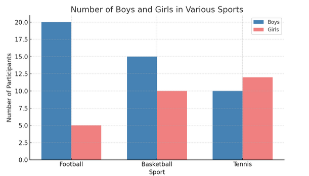
The number of boys and girls who participated in various sports is shown below:
| Sport | Boys | Girls |
|---|---|---|
| Football | 20 | 5 |
| Basketball | 15 | 10 |
| Tennis | 10 | 12 |
Draw a dual bar chart to represent this data.
▶️ Answer/Explanation
For each sport, draw two bars side by side: one for boys, one for girls.
- Football: Boys (20), Girls (5)
- Basketball: Boys (15), Girls (10)
- Tennis: Boys (10), Girls (12)
Use a key (legend) to indicate which color represents boys and which represents girls.
(b) Pie Charts
A pie chart is a circular chart divided into sectors. Each sector represents a category, and the angle of each sector is proportional to the frequency of the data category.
To calculate the angle for each sector:
Angle for each sector = \( \frac{\text{category frequency}}{\text{total frequency}} \times 360^\circ \)
Pie charts are best used to show how a whole is divided into parts (e.g., how a class’s preferences are split among several activities).
Example:
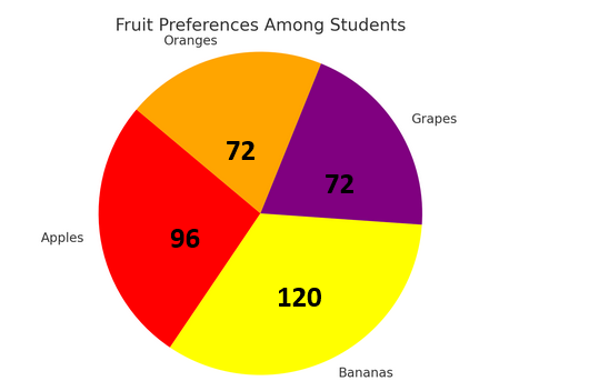
The number of students who prefer different fruits is as follows:
- Apples – 8
- Bananas – 10
- Grapes – 6
- Oranges – 6
Draw a pie chart to represent this data.
▶️ Answer/Explanation
Step 1: Total frequency = 8 + 10 + 6 + 6 = 30
Step 2: Find angles for each sector:
- Apples: \( \frac{8}{30} \times 360^\circ = 96^\circ \)
- Bananas: \( \frac{10}{30} \times 360^\circ = 120^\circ \)
- Grapes: \( \frac{6}{30} \times 360^\circ = 72^\circ \)
- Oranges: \( \frac{6}{30} \times 360^\circ = 72^\circ \)
Step 3: Draw a circle and use a protractor to draw each sector with the calculated angles.
Example:
A survey of 60 people asked how they travelled to work. The results were:
- Car – 24
- Bus – 18
- Cycle – 6
- Walk – 12
Calculate the angle for each sector in a pie chart.
▶️ Answer/Explanation
Total = 60 people
- Car: \( \frac{24}{60} \times 360^\circ = 144^\circ \)
- Bus: \( \frac{18}{60} \times 360^\circ = 108^\circ \)
- Cycle: \( \frac{6}{60} \times 360^\circ = 36^\circ \)
- Walk: \( \frac{12}{60} \times 360^\circ = 72^\circ \)
These angles can be used to accurately draw each section of the pie chart.
(c) Pictograms
A pictogram (or picture graph) uses symbols or pictures to represent quantities. Each symbol stands for a fixed number of items, which should be clearly indicated in a key.
Pictograms are useful for representing discrete data in a simple and visually engaging way. The key should be used to interpret the number of items each symbol represents.
Important points:
- Each picture or symbol must represent the same number throughout the chart.
- If the number is not a whole multiple of the symbol’s value, use partial symbols.
- Always include a key.
Example:
The number of books read by students in one week is shown below:Using the key find number of book read in each Day.
Key: 📘 = 2 books
| Monday | 📘📘📘 |
| Tuesday | 📘📘📘📘 |
| Wednesday | 📘📘 |
| Thursday | 📘📘📘📘📘 |
| Friday | 📘📘📘 |
▶️ Answer/Explanation
Use the key (📘 = 2 books):
- Monday: 3 symbols → 3 × 2 = 6 books
- Tuesday: 4 × 2 = 8 books
- Wednesday: 2 × 2 = 4 books
- Thursday: 5 × 2 = 10 books
- Friday: 3 × 2 = 6 books
Example :
The pictogram shows the number of laptops sold by a store over five months: Using the key find number of laptop sold in each month.
Key: 💻 = 10 laptops
| January | 💻💻💻 |
| February | 💻💻💻💻 |
| March | 💻💻💻💻💻 |
| April | 💻💻💻💻💻💻 |
| May | 💻💻💻💻💻💻💻 |
▶️ Answer/Explanation
Use the key (💻 = 10 laptops):
- January: 3 × 10 = 30 laptops
- February: 4 × 10 = 40 laptops
- March: 5 × 10 = 50 laptops
- April: 6 × 10 = 60 laptops
- May: 7 × 10 = 70 laptops
(d) Stem-and-Leaf Diagrams
A stem-and-leaf diagram is a method of displaying numerical data where each value is split into a “stem” (the leading digit(s)) and a “leaf” (the last digit). The leaves are listed in ascending order, and the diagram must include a key.
Key Points:
- Data should be arranged in order.
- The diagram should include a clear key to interpret values.
- Useful for finding the mode, median, and range quickly.
Example:
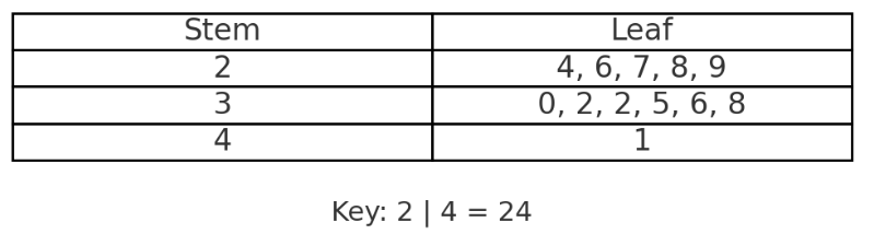
The ages (in years) of 12 students in a club are:
13, 15, 14, 16, 15, 13, 17, 14, 16, 13, 15, 18
Draw an ordered stem-and-leaf diagram for this data.
▶️ Answer/Explanation
Step 1: Organise and order the data:
13, 13, 13, 14, 14, 15, 15, 15, 16, 16, 17, 18
Step 2: Construct the stem-and-leaf diagram:
![]()
Key: 1 | 3 = 13 years
Example:
The scores out of 50 in a test are:
24, 32, 27, 29, 35, 41, 38, 36, 32, 30, 26, 28
Draw an ordered stem-and-leaf diagram for this data.
▶️ Answer/Explanation
Step 1: Order the data:
24, 26, 27, 28, 29, 30, 32, 32, 35, 36, 38, 41
Step 2: Create the stem-and-leaf diagram:
Key: 3 | 2 = 32 marks
(e) Simple Frequency Distributions
A frequency distribution is a table that shows how often each value (or group of values) occurs in a dataset. It is used to organise raw data into a clear format for further analysis or graphical representation.
Key Notes:
- Can be for discrete or grouped data.
- Frequencies show the number of times each value or class occurs.
- Grouped frequency tables use class intervals (e.g. 10–19, 20–29).
Example:
The number of books read by 20 students in a month is recorded below:
1, 3, 2, 1, 2, 3, 4, 2, 1, 3, 2, 2, 4, 1, 3, 2, 1, 1, 3, 2
Draw a simple frequency table.
▶️ Answer/Explanation
| Books Read | Frequency |
|---|---|
| 1 | 6 |
| 2 | 7 |
| 3 | 5 |
| 4 | 2 |
Example:
The times (in minutes) taken by 25 students to complete a task are:
12, 18, 21, 25, 32, 16, 24, 29, 15, 13, 19, 22, 17, 31, 27, 35, 28, 33, 30, 14, 26, 36, 34, 23, 20
Group the data using class intervals of width 5 starting from 10–14 and draw a frequency table.
▶️ Answer/Explanation
| Time (min) | Frequency |
|---|---|
| 10–14 | 4 |
| 15–19 | 6 |
| 20–24 | 6 |
| 25–29 | 5 |
| 30–34 | 3 |
| 35–39 | 1 |