Measures of Central Tendency (3M)
Definition:
These are values that describe the center or typical value of a data set.

Mean (Arithmetic Mean):
Sum of all data values divided by the number of values.
Formula:
\( \bar{x} = \frac{\sum x_i}{n} \) where \(x_i\) = each data point, \(n\) = number of data points.
Median:
The middle value when data is arranged in ascending order.
If \(n\) is odd, median is \(\frac{n+1}{2}\)-th value; if even, average of \(\frac{n}{2}\)-th and \(\frac{n}{2} + 1\)-th values.
Mode:
The most frequently occurring value(s) in the data set.
Example Calculate the mean of the data set: 4, 8, 6, 5, 7. ▶️ Answer/ExplanationSolution: Sum of data $= 4 + 8 + 6 + 5 + 7 = 30$ Number of data points $= 5$ Mean = Total sum $÷$ Number of data $= 30 ÷ 5 = 6$ |
Example Find the median of the data set: 12, 7, 9, 15, 10. ▶️ Answer/ExplanationSolution: Order data from smallest to largest: 7, 9, 10, 12, 15 Since there are 5 data points (odd number), median is the middle value: 10 |
Example Find the mode of the data set: 5, 7, 5, 8, 9, 5, 7. ▶️ Answer/ExplanationSolution: Count the frequency of each number:
Mode = 5 (most frequent) |
Estimation of Mean from Grouped Data
Definition:
When data is grouped into class intervals, mean is estimated using midpoints.
Formula:
\( \displaystyle \bar{x} = \frac{\sum f_i x_i}{\sum f_i} \)
Where:
\(f_i\) = frequency of the \(i\)-th class
\(x_i\) = midpoint of the \(i\)-th class
Steps:
Find midpoints for each class interval.
Multiply each midpoint by its class frequency.
Sum all products and divide by total frequency.
Example: Measures of Central Tendency and Spread from Grouped Frequency Table Consider the data: 10, 20, 20, 20, 30, 30, 40, 50, 70, 70, 80 (total \( n = 11 \)). The frequency table is:
Calculate the mean, mode, median, standard deviation, range, and interquartile range. ▶️ Answer/ExplanationSolution: Mean: $ \text{mean} = \frac{1 \times 10 + 3 \times 20 + 2 \times 30 + 1 \times 40 + 1 \times 50 + 2 \times 70 + 1 \times 80}{11} = \frac{440}{11} = 40 $ Mode: The value with highest frequency is 20 (frequency = 3). Median: Position \( \frac{n+1}{2} = 6 \). Using cumulative frequencies (see below): the 6th entry corresponds to 30, so median = 30.
Standard Deviation: From a calculator or GDC, \( \sigma \approx 22.96 \). Range: $ \text{range} = \text{max} – \text{min} = 80 – 10 = 70 $ Interquartile Range (IQR): \( Q_1 \) = median of first 5 entries (position 3) = 20. |


Modal Class (For Equal Class Intervals Only)
Definition:
The modal class is the class interval with the highest frequency in grouped data with equal class widths.
Interpretation: ‘
This class represents the most common range of data values.
Example: Suppose 100 students took an exam with scores between 1 and 60. The grouped frequency table is:
Find the mean, standard deviation, and modal class. ▶️ Answer/ExplanationSolution: Step 1: Use midpoints of each interval. $ \mu = \frac{8 \times 5 + 12 \times 15 + 10 \times 25 + 25 \times 35 + 35 \times 45 + 10 \times 55}{100} = \frac{3470}{100} = 34.7 $ Step 2: Standard Deviation (from GDC): $ \sigma = 14.31 $ Step 3: Modal Class: The class interval with the highest frequency is: $ \text{Modal class} = 40 < x \leq 50 $ |

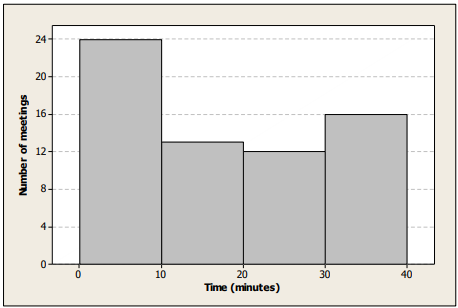
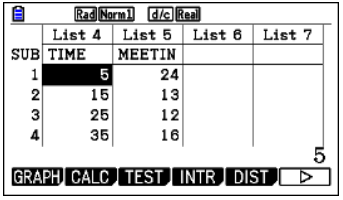
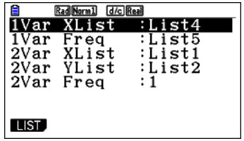
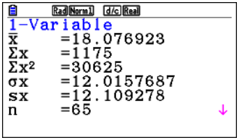
Example: (USING GDC) Consider the frequency histogram for the distribution of the duration, t, in minutes of meeting times
Find an estimate for the mean time. ▶️ Answer/ExplanationSolution: Each class will be represented by its midpoint. So an estimate of the mean is $\bar{x} = \frac{\sum x_i}{n} \approx 18.077$ where $x_i$ is the midpoint of the ith class.
|
Measures of Dispersion

Dispersion measures how spread out data values are around the central tendency.
Interquartile Range (IQR): Difference between third quartile (Q3) and first quartile (Q1).
\( \mathrm{IQR} = Q_3 – Q_1 \)
Standard Deviation (SD): Square root of variance, represents average distance of data points from the mean.
For sample data:
\( s = \sqrt{\frac{1}{n-1} \sum (x_i – \bar{x})^2} \)
Variance: Average of squared deviations from the mean.
\( s^2 = \frac{1}{n-1} \sum (x_i – \bar{x})^2 \)
USE OF GDC
We can use the GDC to obtain all these measures. For Casio CFX:
MENU → STAT → Enter data in List 1 → CALC → 1VAR → Obtain statistics.
Example Calculate the range of the data set: 14, 22, 19, 17, 24. ▶️ Answer/ExplanationSolution: Maximum value = 24 Minimum value = 14 Range = Maximum – Minimum = 24 – 14 = 10 |
Example Find the variance of the data set: 2, 4, 6, 8, 10. ▶️ Answer/ExplanationSolution: Calculate the mean: (2 + 4 + 6 + 8 + 10) ÷ 5 = 30 ÷ 5 = 6 Calculate squared differences from mean:
Find the average of squared differences (variance): (16 + 4 + 0 + 4 + 16) ÷ 5 = 40 ÷ 5 = 8 |
Quartiles of Discrete Data
Definition:
Quartiles divide ordered data into four equal parts.
- Q1 (First Quartile): Median of the lower half of the data (25th percentile).
- Q2 (Second Quartile): Median of the entire data set (50th percentile).
- Q3 (Third Quartile): Median of the upper half of the data (75th percentile).
Use:
Helps describe the spread and skewness of data.
Example: Suppose 100 students took an exam with scores between 1 and 60. The grouped frequency table is:
Determine the quartiles, draw a box plot, and identify any outliers. ▶️Answer/ExplanationSolution: Use cumulative frequency diagram.
Draw Box and Whisker Plot
Calculate IQR and check for outliers $ \text{IQR} = Q_3 – Q_1 = 46 – 25 = 21 $ $ \text{Lower boundary} = Q_1 – 1.5 \times \text{IQR} = 25 – 1.5 \times 21 = -6.5 $ $ \text{Upper boundary} = Q_3 + 1.5 \times \text{IQR} = 46 + 1.5 \times 21 = 77.5 $ Conclusion: No outliers exist in the data set. |

